Upload your Excel or CSV file
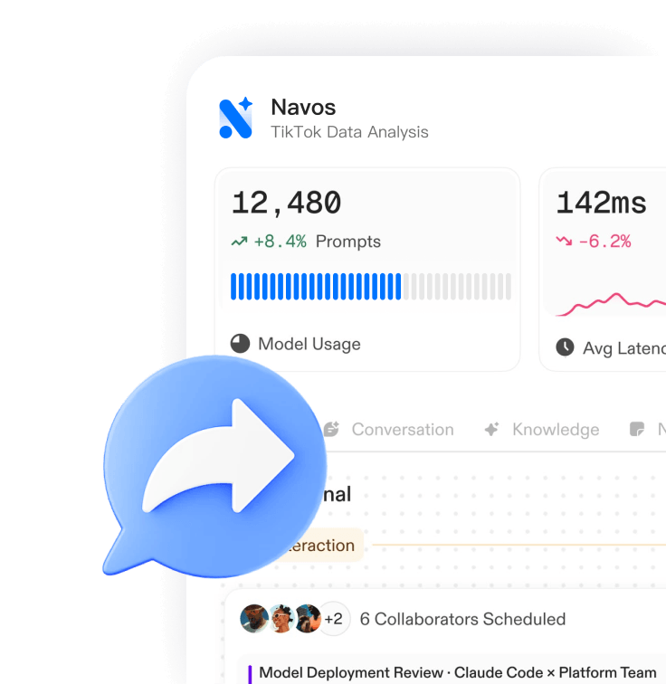
Sign in to the Navos web app and drop your spreadsheet into the workspace — sales exports, inventory snapshots, campaign reports, or any tabular data you already have.
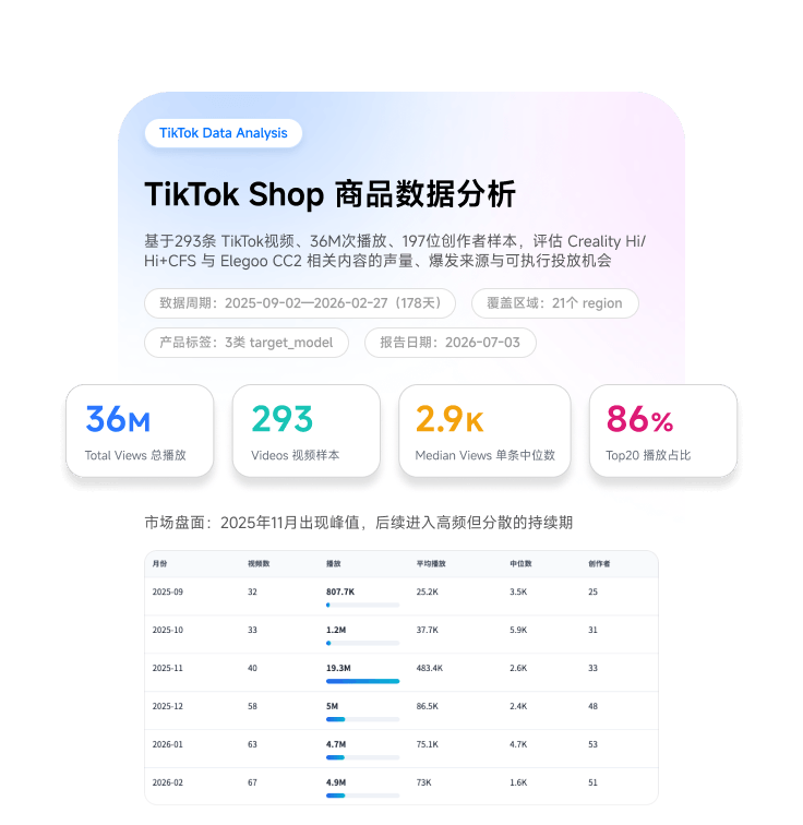
Navos turns your Excel or CSV file into an interactive KPI dashboard automatically. Upload sales, inventory, or campaign data — the AI Data Analyst profiles every column, picks the right KPIs and charts, and writes plain-language findings you can act on. No formulas, no pivot tables, no dashboard templates.
Works with .xlsx and .csv · English & 中文 reports · Interactive artifact output
Three steps from raw spreadsheet to interactive dashboard — no template required.
Sign in to the Navos web app and drop your spreadsheet into the workspace — sales exports, inventory snapshots, campaign reports, or any tabular data you already have.
The Data Report Generator skill profiles the file programmatically — structure, missing values, outliers, distributions, correlations — then the AI Data Analyst computes KPIs and identifies the trends worth your attention.
Receive an interactive analysis artifact: KPI tiles, charts chosen to fit your data, and a written narrative with an executive summary and prioritized findings. Share it with a link or keep iterating in chat.
A dashboard is only useful if it answers questions. The AI Data Analyst does the analysis, not just the charting.
The AI reads your columns and derives the KPIs that matter — revenue, growth, conversion, averages, and their trends — without you configuring a single measure.
Time series, distributions, category comparisons, correlations — each visualization is selected to fit the shape of your data, not picked from a template.
Every dashboard comes with a written narrative: what changed, what stands out, and what to look at next. The reasoning is done by the AI, not left to the reader.
Missing values, inconsistent formats, and outliers are detected and reported during profiling, so you know exactly how trustworthy each number is.
Generate the same analysis in English or Chinese — ready for international teams and local stakeholders alike.
Ask follow-up questions in chat, drill into segments, or hand findings to Navos AI agents to act on — the dashboard is a starting point, not a dead end.
If it fits in a spreadsheet, the AI Data Analyst can turn it into a dashboard.
Upload transaction exports to see revenue trends, top products, channel breakdowns, and period-over-period comparisons.
Analyze inventory snapshots and sell-through data to spot stockouts, slow movers, and margin leaks across stores and SKUs.
Turn ad platform exports into unified campaign dashboards — spend, conversions, ROAS, and creative performance in one view.
Build weekly and monthly KPI review packs automatically from the exports your team already produces.
Yes. Upload an Excel (.xlsx) or CSV file to Navos and the AI Data Analyst generates an interactive dashboard automatically: it profiles your data, computes the relevant KPIs, selects fitting charts, and writes a narrative summary of the findings — typically within minutes.
Three steps: sign in to the Navos web app, upload your Excel or CSV file to the workspace, and ask for an analysis. The Data Report Generator skill handles data profiling and KPI computation, and you receive a shareable interactive dashboard artifact.
Excel (.xlsx) and CSV files. Export your data from any tool that produces tabular files — POS systems, e-commerce platforms, ad managers, ERPs, or plain spreadsheets.
No. The AI Data Analyst replaces the manual steps of dashboard building — formulas, pivot tables, chart configuration, and layout. You upload the file and review the results in plain language.
The analysis runs in two stages. First, programmatic profiling: structure checks, missing values, outliers, distributions, and correlations. Then the AI Data Analyst interprets the results: KPI trees, trends, segment comparisons, and prioritized written findings.
Yes. Navos follows a privacy-first architecture and complies with global privacy standards such as GDPR and CCPA. Your uploaded files are used to generate your own analysis and are not shared with other customers.
BI tools are powerful but require setup: data modeling, measure definitions, and chart configuration, usually owned by an analyst. Navos is conversational — you upload a file and get an analyzed, written-up dashboard in minutes. For recurring enterprise reporting pipelines, BI tools remain a good fit; for fast answers from the files you already have, the AI Data Analyst is faster.
Navos uses a purpose-built Data Report Generator skill with a two-stage pipeline: deterministic data profiling first, then AI interpretation. That means consistent report structure, KPI calculations done in code rather than estimated by a language model, and an interactive artifact output you can share — plus AI agents in the same workspace that can act on the findings.
Yes. The AI Data Analyst detects the KPIs your file supports — revenue, growth, conversion, averages, and their trends — and assembles them into a KPI dashboard with supporting charts. Ask for specific metrics in chat and the dashboard is updated accordingly.
No. Templates only rearrange charts you still have to build yourself. An AI dashboard generator works from the data instead: Navos profiles your columns, computes the KPIs, and lays out an interactive dashboard automatically — any spreadsheet becomes its own template.
Upload your spreadsheet and let the AI Data Analyst do the analysis — KPIs, charts, and written insights in minutes.